


Getting the Most Out of Your Email Header, Footer and Navigation
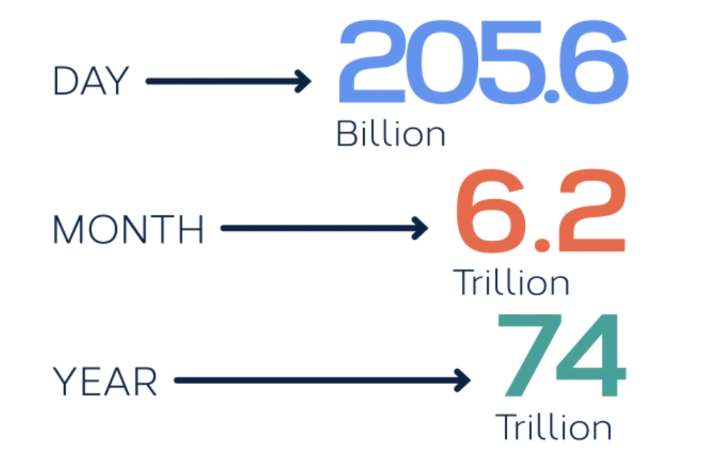
When you consider that over 200 billion emails are sent every day, you’ll want to make sure that your email provides an easy-to-use, engaging layout.
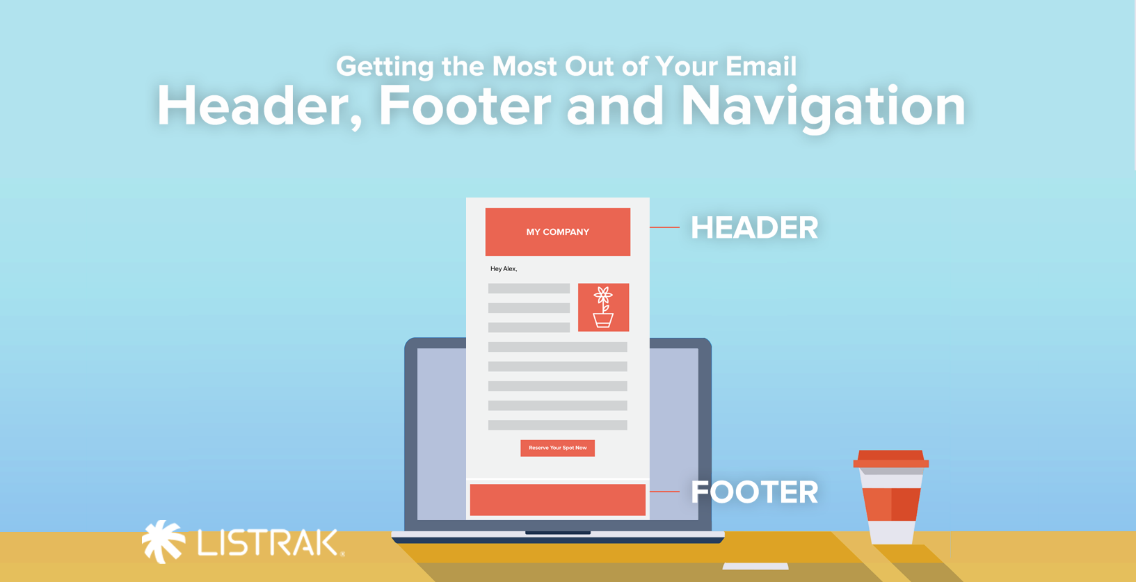
Space is Precious, So Choose Wisely
First, let’s talk about the entirety of your email from top to bottom. The header, navigation, and footer are important − but not as important as the main message.
That means although your header gives the recipient easy access to your site, it shouldn’t take up more room than necessary. Keep in mind that the more space and time that is taken up by the header, the more likely you will see a drop in your conversion rates.
To see higher conversion rates, the best practice is to make sure your subscriber sees that main content ASAP and can easily and quickly convert quickly.
A couple of tips for your header…
- Keep your logo smaller. I know, I know. I just contradicted everything that little voice in your head is saying – you want your brand shouted from every mountaintop! But remember your audience; these emails are going to people who already know your brand and style, and can probably tell the email is from you with just a glance. Would you rather use that extremely valuable real estate (especially on mobile) for your logo… or the main content? We think you should use it for the main content.

- Hide preheaders on mobile. If you choose to have your preheader visible in your email on desktop, hide it on mobile. Why? Because it will still display the subject line in mobile inboxes but won’t take up precious space in the message itself.
Now for that navigation…
- Consider skipping the top navigation altogether. Navigation is important to give readers one last chance to go to your site after they’ve read the content. So why not give them those options at the bottom of the message as well? Adding a navigation in the footer will still provide access to your site if the main content doesn’t quite call out to them, and it doesn’t take up valuable space at the top of the email.
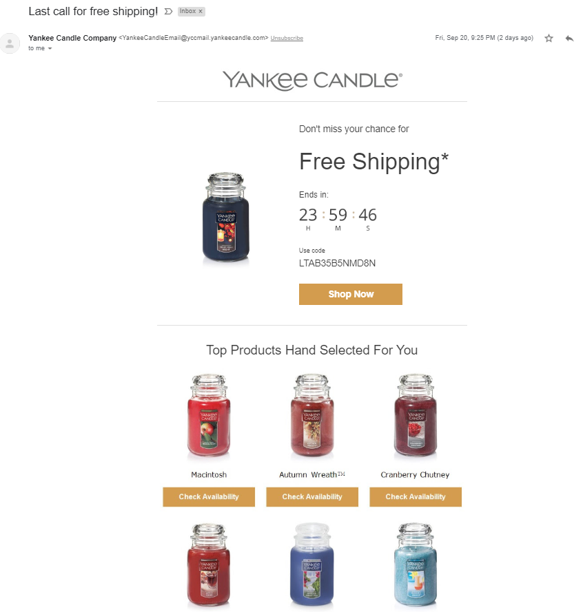
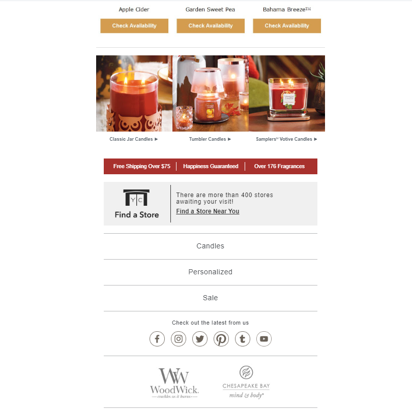
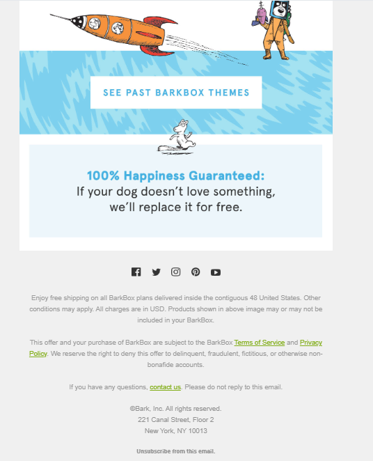
This email from Yankee Candle is a great example of skipping the top navigation and getting right to the point. A reminder that the free shipping deal is almost over and if you want to take advantage of it you’d better hurry. Once you scroll down the page, you’ll find additional navigation at the bottom. Image courtesy of Yankee Candle marketing email undefined.
- Limit the your number of navigation items. Keep your navigation under six items. You read that correctly. Too many options can become overwhelming to a reader, and cause them to ignore the navigation altogether. It can also cause the navigation to wrap to two lines, which would take even more space away from the most important elements.
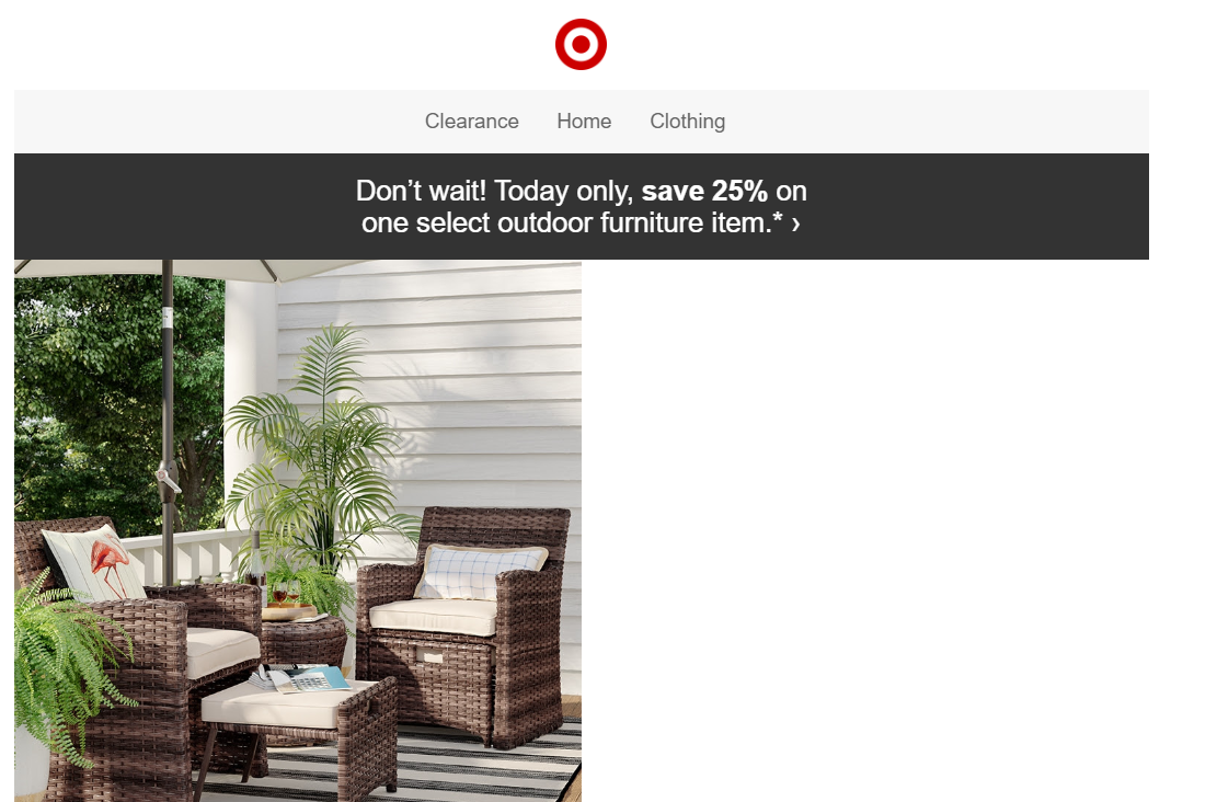
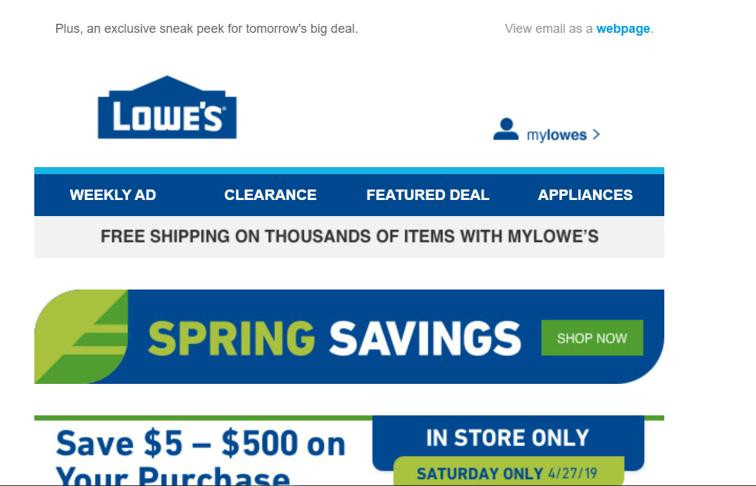
Target does a nice job of consolidating the navigation on their emails. This email only includes a few navigation options for users, making it easy to decide where to go next. Image courtesy of Target marketing email.
- Stack your footer navigation on mobile. It’s hard to tap little links on a phone, right? Make it easier for your readers by stacking your mobile navigation in large, “tappable” buttons at the bottom of the message.
- Hide the top navigation on mobile. We’ve already mentioned how important real estate is in an email. Do you really want a quarter of the screen to be a logo and navigation? Probably not.

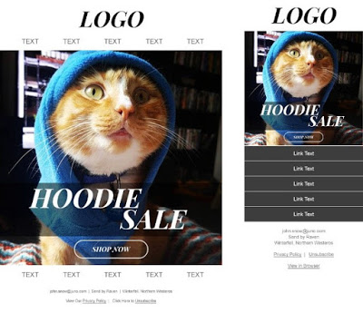
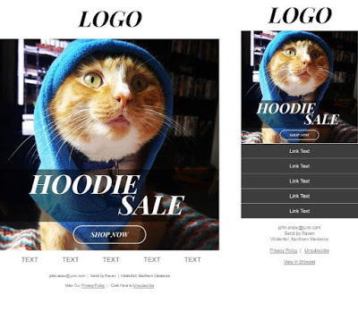
Although this example does include the company logo, it does show how much more effective it is on mobile to forego the top navigation. Without navigation at the top, the reader's eyes go right to the content and see the sale information at first glance rather than having to scroll through the additional information. Image courtesy of Loft marketing email.
Finally, the footer…
- Get social! Including social media icons in each send gives readers a way to get to these networks, and encourages brand loyalty and engagement. By adding it to the footer, you’re providing access without distracting from the main message.
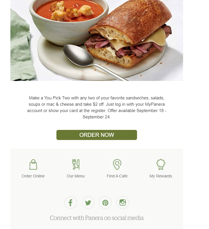
Panera does a great job of
- Follow spam regulations. According to CAN-SPAM and CASL legislation, your email needs to include the physical address of your business, an unsubscribe link and a privacy policy. All these elements fit nicely as a bit of text at the bottom of the email.
- Add a “view in browser” link. While not a requirement, this link will make it much easier for customers to view and share your email. If there is a glitch in a reader’s inbox, if they’re having issues on their mobile device, or if they just love your content and want to share the email, this link is important to improving user experiences.
Do You Still Need some inspiration?
Here are a few some of my favorite layouts for your header, navigation, and footer.
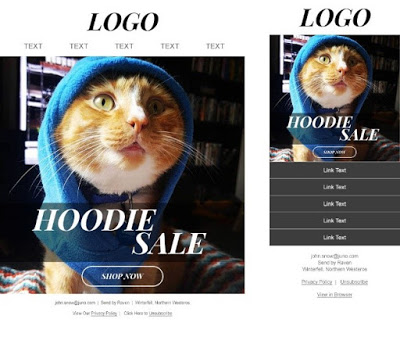
Option 1: Dual Navigation
Features a desktop version with a header, dual navigations (top and bottom) and a footer. The top navigation hides on mobile, stacking the bottom navigation for an optimized experience. This is an extremely common layout to give readers easy access to the website at all points in the email.
Option 2: Mobile Stacking Navigation
Includes a header, single (bottom) navigation and a footer that stacks on mobile. This is a great option to keep a simple, clean layout while offering the reader one last chance to get to your site at the bottom.
Option 3: Single Navigation
Features a header, single (top) navigation and footer. On mobile, the top navigation will move to the bottom and stack. Like the previous option, this layout allows a reader access to the site but keeps the email clutter- free. The show/hide on the two navigations allows the email to morph into an equally great experience on both desktop and mobile.
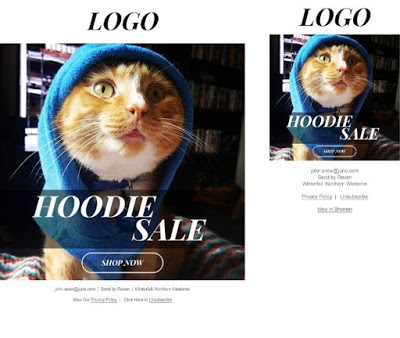
Option 4: Forgo Navigation All Together
If your messages are going to be very focused on specific products, you may want to consider this layout. It foregoes any navigation and simply sandwiches the content between the header and footer. If the customer is not interested in the main marketing message, they do not have a means of getting to the site like a footer navigation.
Do you think you’ll use any of these tips for your header, navigation, and footer?
You’ve got one chance to impress your customers, make sure your email design makes a lasting impression. For those in the email industry, the header, navigation, and footer aren’t new concepts. But what makes these elements good? These pieces are usually repeated in each email you send, it’s important to so make sure your layouts are effective, beautiful, and easy to … well, navigate.


.png)
